About Us
WE'RE A CLOSE TEAM OF CREATIVES, DESIGNERS & DEVELOPERS WHO WORK TOGETHER TO CREATE BEAUTIFUL, ENGAGING DIGITAL EXPERIENCES.
NETWORKING
The Alpha phase where we research your competition and laying the foundation for your worldwide grand opening!
ANALYTICS.
Focusing on your vision and aesthetics we will analyze in depth your website requirements for a modern, functional and eye catching outcome.
DEVELOPMENT.
The heavy duty phase where the preparation, passion and experience comes into play to create magic and develop a beautiful final product. Always with ♥ !
ALPHA G33K PHILOSOPHY.
We believe in the continuous refinement of our web design skills, consulting services and support so we can architect, deploy and optimize your technology assets, culminating in work of lasting integrity.
WHAT WE ACHIEVE.
With methodical planning and extensive client support we develop applications that helps increase efficiency and workflow of your business fully integrated with your entire operation.
AT THE END.
Our passion for technology will overcome any obstacles of complexity from your project leading to a highly reliable and functional final product.













SERVICES
JUST CHECK OUT ALL OF THE SERVICE LISTS BELOW TO GET A GENERAL IDEA OF WHAT WE ARE CAPABLE OF DELIVERING.
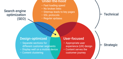
How to conduct a website analysis
Your website is the gateway to your business. A good website analysis...
31/03/20230 comment
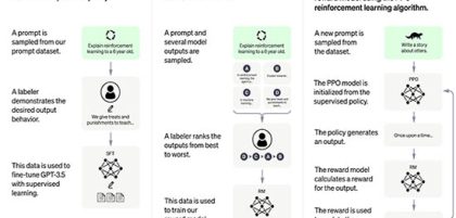
Develop Your Own Custom ChatGPT
ChatGPT is fine-tuned from a model in the GPT-3.5 series, which finished...
0 comment

10 SEO tips for Google ranking
Easy ways to get your website found by more customers There’s no...
0 comment
Work
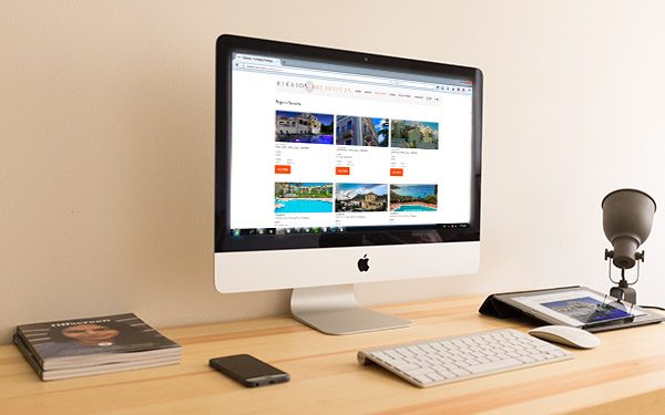
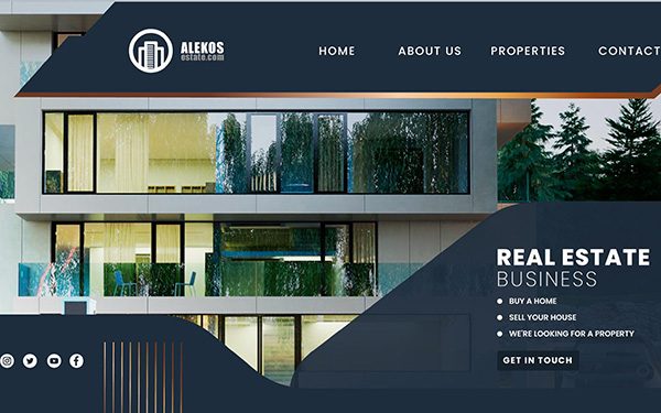
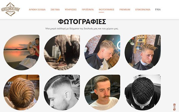
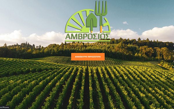
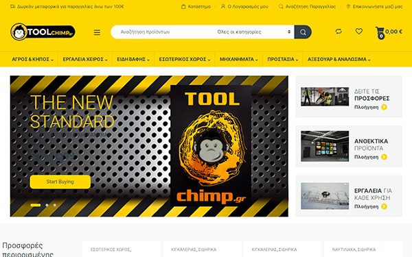
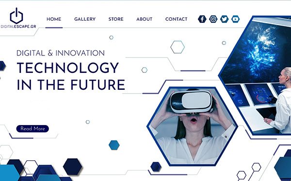
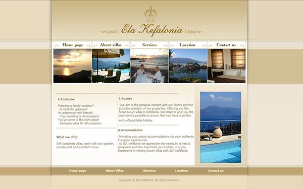
WE BELIEVE OUR WORK SPEAKS FOR ITSELF. BROWSE OUR MOST RECENT PROJECTS BELOW.
READY TO START CONVERSATION?
CONTACT
WE CREATE BEST OPPORTUNITIES FOR YOUR BUSINESS.
Call Us (30) 6983407064 Monday–Friday | 10am–9pm (GMT +2)
Visit Us Argostoli, Kefalonia, Greece
